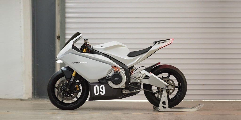
Two months ago Segway shocked the internet by introducing its first ever electric motorcycle, the Segway Apex. The company better known for its affordable electric kickscooters had dropped a 200 km/h (124 mph) electric sportbike seemingly out of nowhere.
Now that the dust has settled, we’re getting more insight into the interesting backstory that led to the Segway Apex.
In 2019, Segway decided to expand into more street-worthy electric vehicles like Vespa-style seated electric scooters.
The company rolled out its seated electric scooter designs this past December, but the scooters weren’t the only surprise at the unveiling.
Segway and its parent company Ninebot wanted a larger halo product to excite customers and demonstrate the company’s ability to build larger and more powerful electric two-wheelers.
They wanted to build a high-speed electric motorcycle. A veritable sportbike.
The only problem was that they had never designed a motorcycle before.
So they turned to a largely unknown designer. A man so obscure he goes only by the initials “JC”.
JC was tasked with taking Segway’s concept electric motorcycle, a bike built on the chassis of an existing ICE motorcycle, and turning it into their vision.
As JC described it, there was a period of friction when he butted heads with Segway. The company originally wanted a design so far out there and revolutionary that it would shock consumers and be unlike anything anyone had ever seen before. JC worried that such a design would alienate much of the existing motorcycle community, and instead he pushed for a sporty design that was familiar yet eye-catching and could be appreciated by a larger audience.
As he explained to EMN:
I believe a good design should have universal appeal. I’m glad they trusted my judgment to go with this refined, clean approach. So far the response from the internet has been overwhelmingly positive to the design.
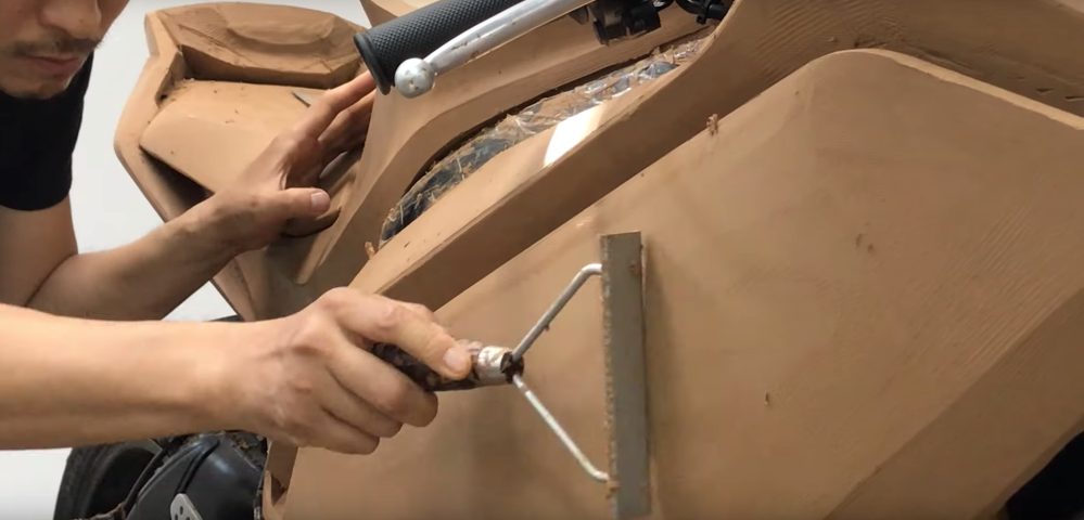
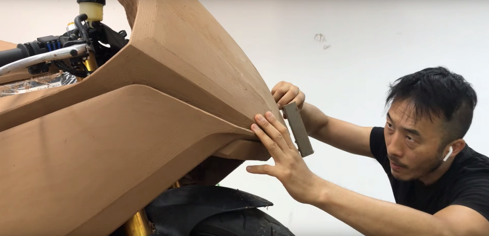
JC has over 20 years of experience in product design and is used to designing in 3D with CAD. But for this project, he decided to begin in a more old-school fashion with full-size clay modeling. That meant that he had to hand sculpt the design.


To save time, he used each half of the bike to explore a different concept until he was sure he liked the direction it was going.
He expanded upon his design goals and the choices he made along the way:
I wanted a clean and minimalist design that would be part of the client’s product language. I also wanted something different from the current trend in transportation design, less saturation of visual stimulation. The excitement of a motorcycle can be expressed in a more subtle way, with proportion, strong character lines and clean surface treatment.
The side panels are large and uninterrupted with minimal features. Key character lines came from folding of geometric surfaces to give it a sense of strength. The front fairing is minimalist by using clean surfaces with the headlight tucked away, giving it a more neutral expression.
The visual center of gravity is moved further forward to create a sense of motion. The motor and the battery are exposed on each side to showcase the technology. They are also separated visually from the side panels to form a power unit to highlight the electric powertrain.
